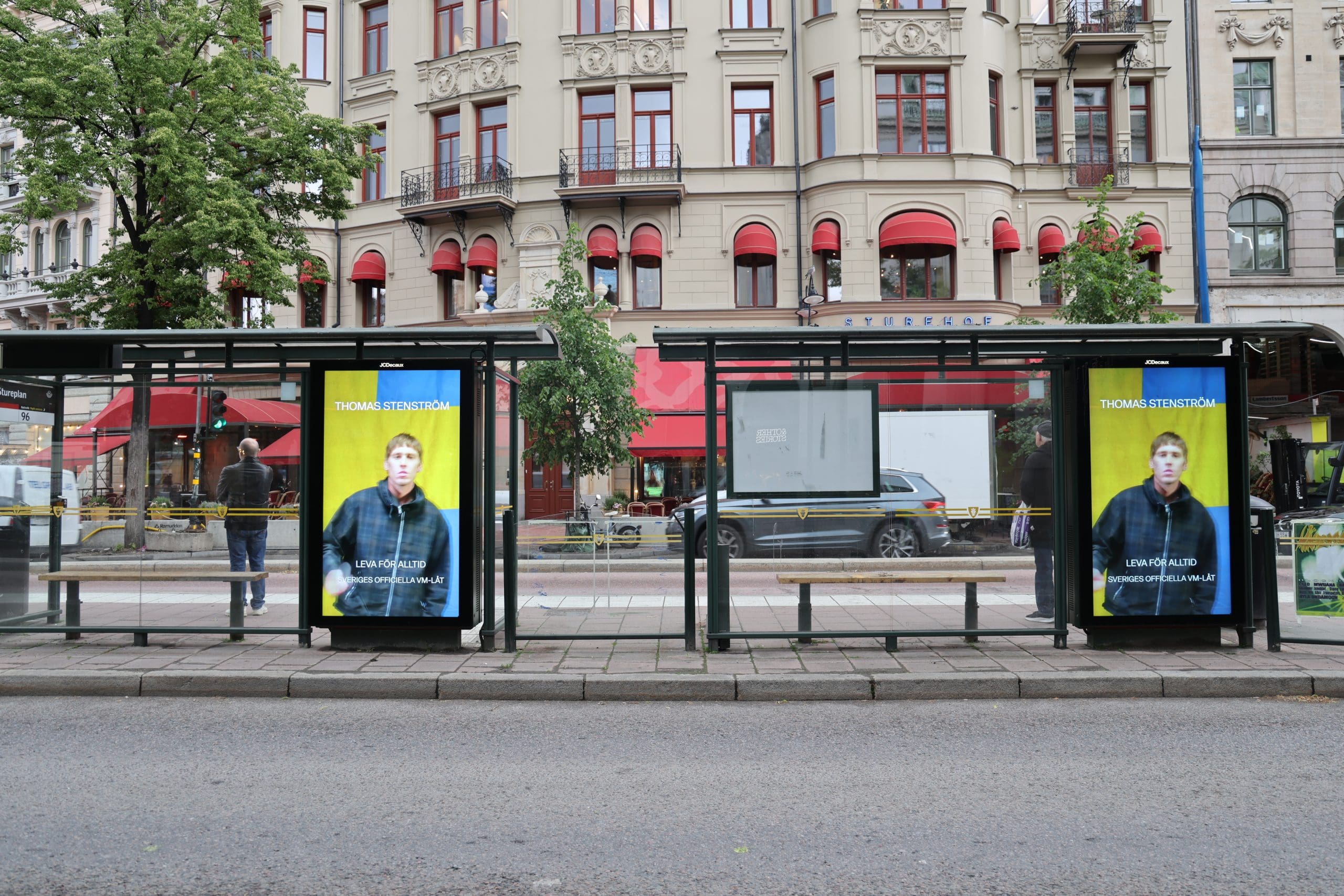
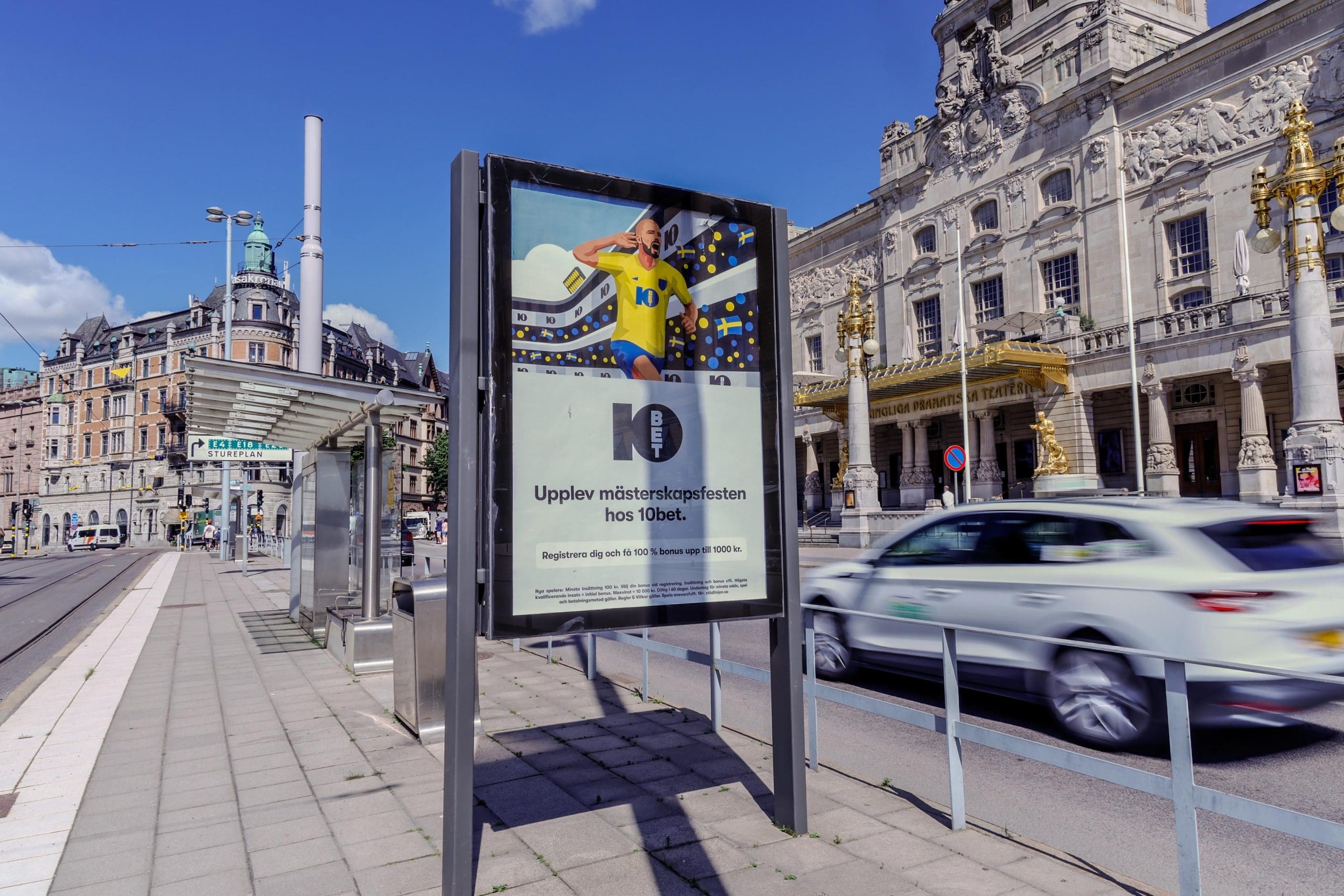
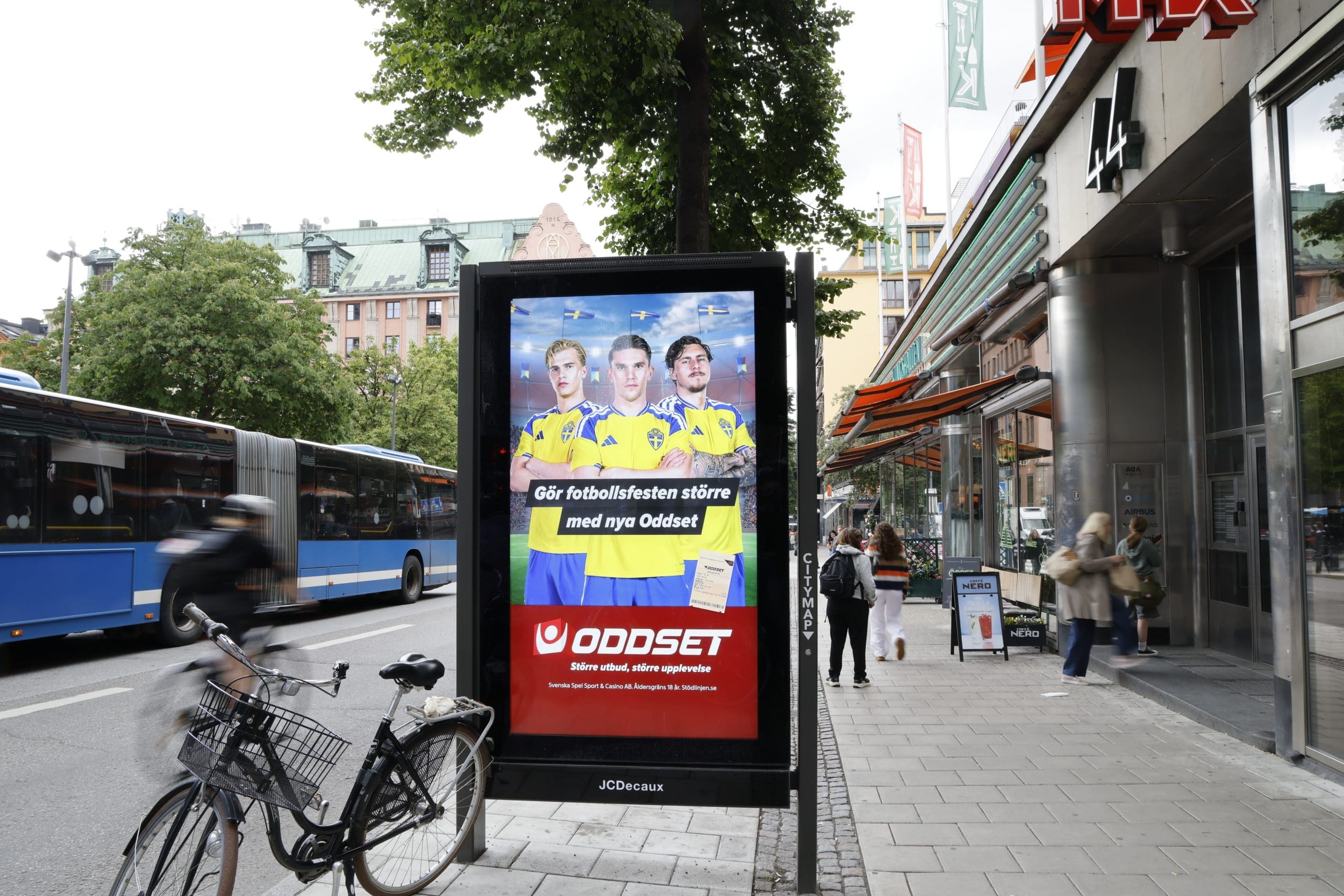
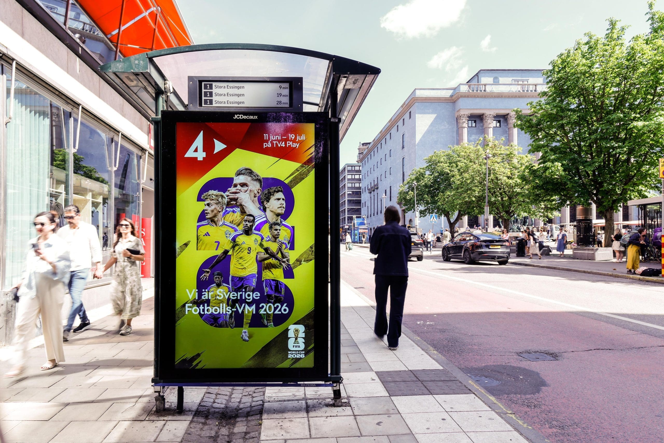
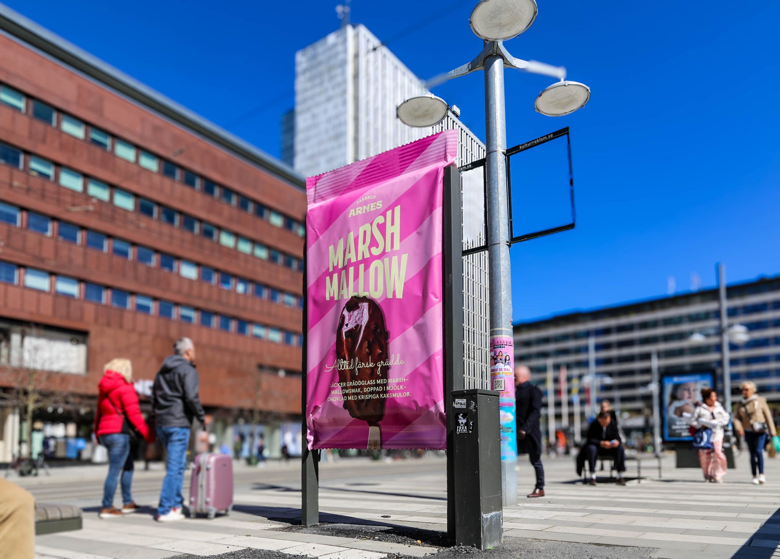
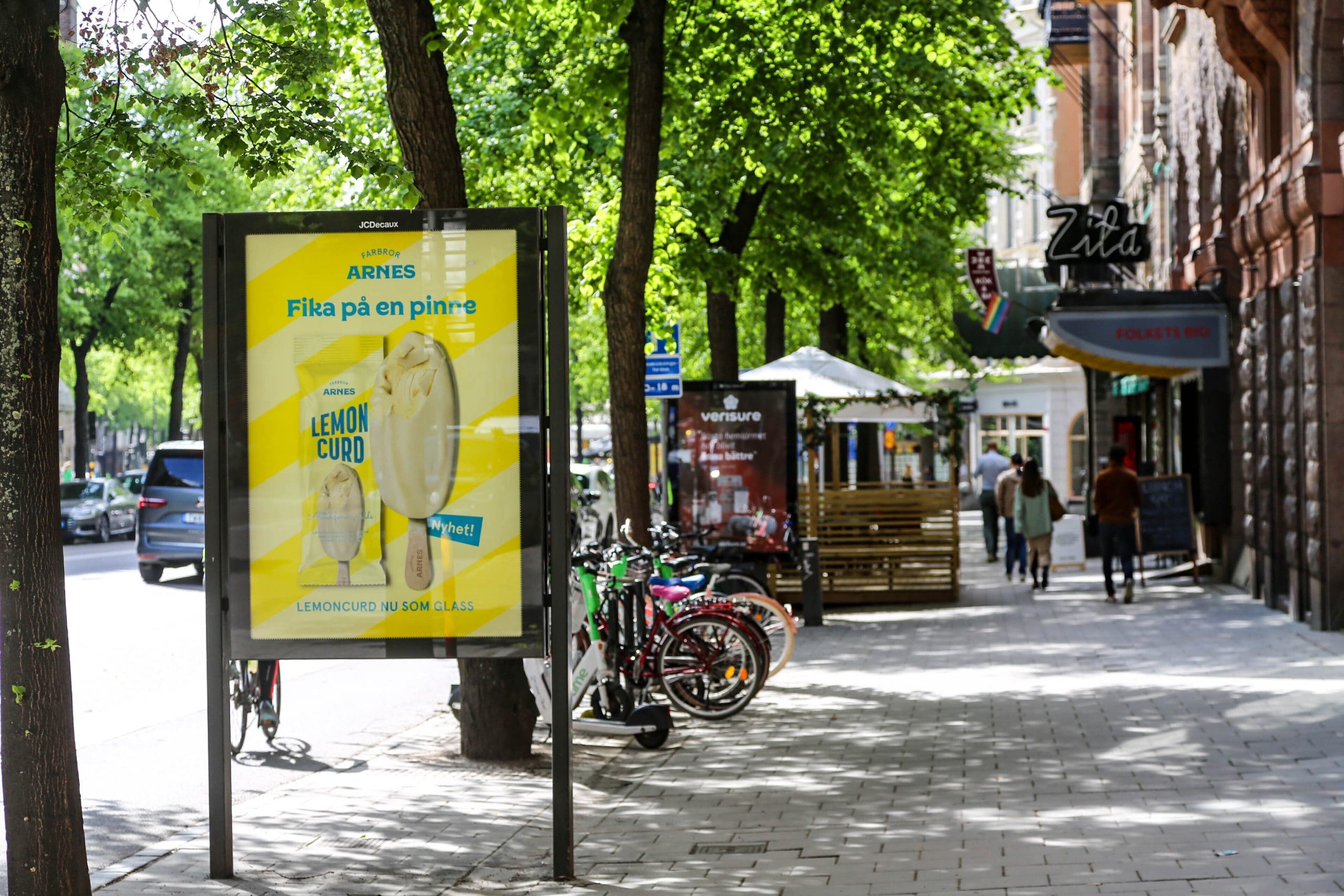
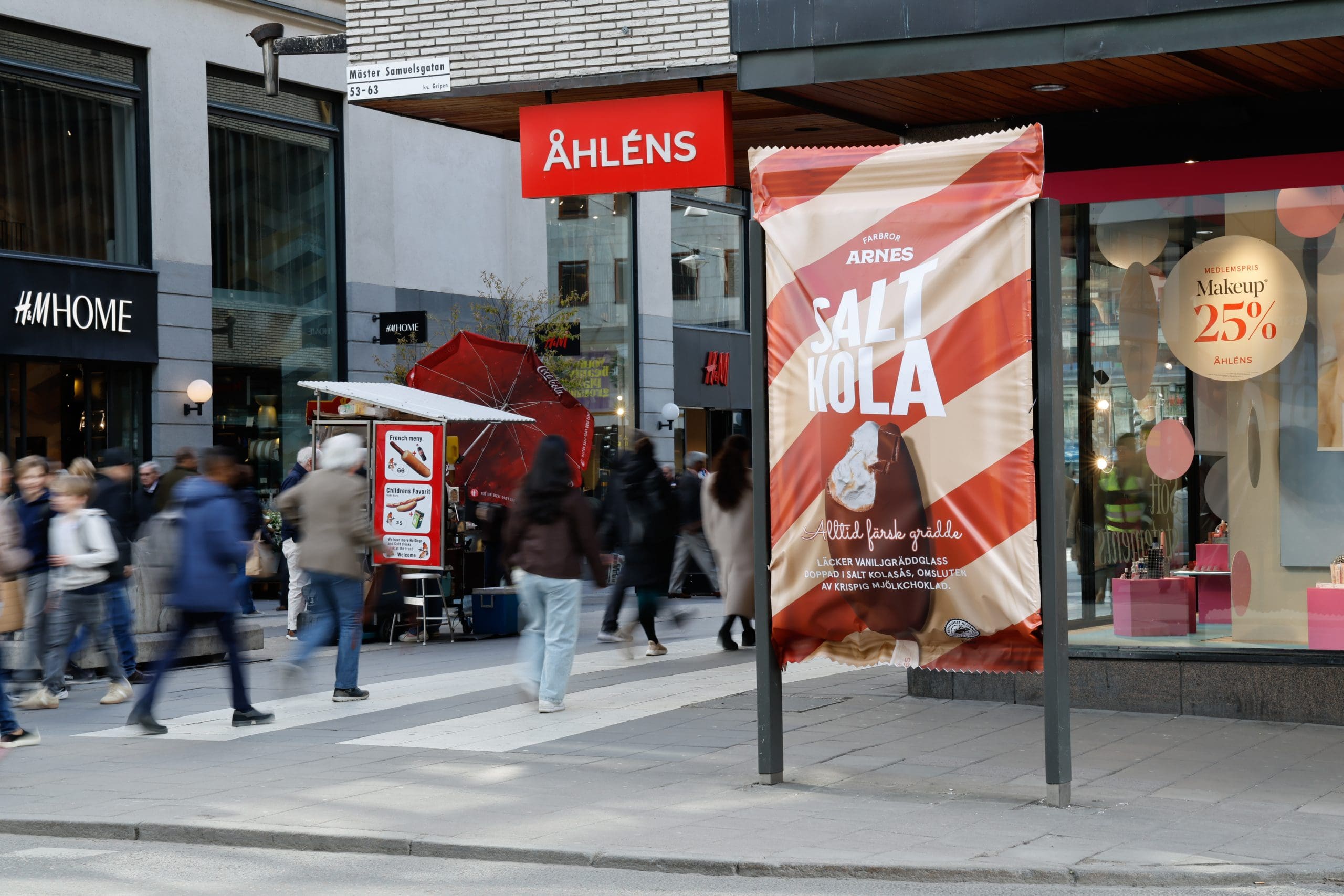
High summer temperatures, upcoming holidays and European Championship fever – the city is covered in blue-and-yellow campaigns 💙💛⚽. Before you shut down your laptop for summer, we’d like to share an interesting insight on colour in marketing and an interview with a brand that chose to go against the flow.
Rethinking colour in marketing
Instead of chasing the “right” colour based on simplified colour psychology, marketers sometimes need to think in reverse. Certain colour analyses have over time become almost unquestioned norms – for instance, “blue signals trust”. Modern research clearly shows that it’s far too simplistic to assume that colour alone determines how credible a brand is perceived to be. If your industry is already saturated with blue, as is very much the case in financial services, it is far more strategic to enter with a distinct alternative colour than to launch yet another blue campaign.
So the right question is not: “Which colour creates the most trust?” Instead, ask: “Which colour strengthens our positioning, reflects our promise, and cuts through for our specific target audience?” And then dare to stick to that colour consistently over time.
You’ll find an example of a brand that chose a completely different colour direction from its competitors further down in this letter.
Insight from JCDecaux & System1
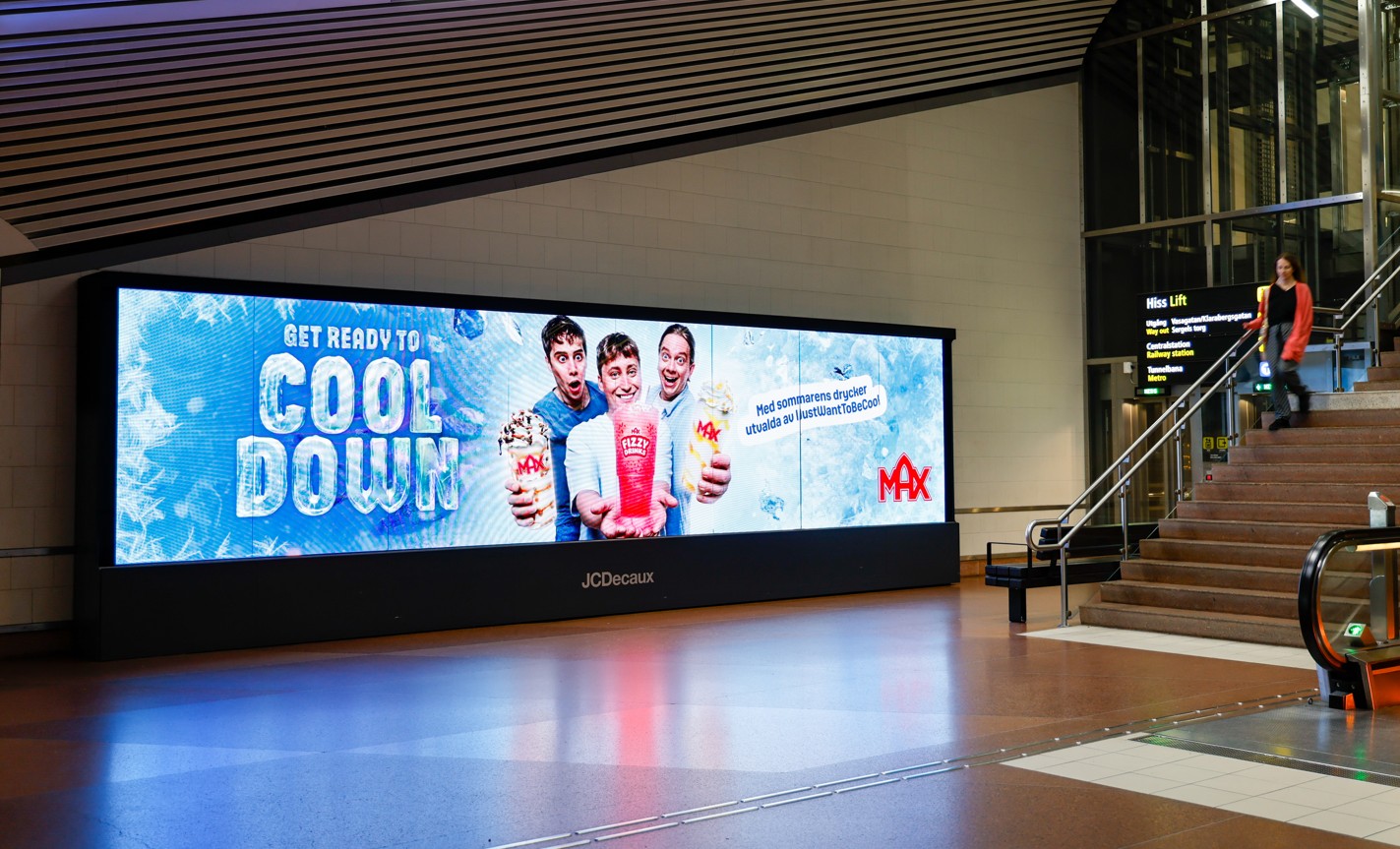
A study from JCDecaux and System1 shows that truly memorable advertising is built on the same key components: bold colours, strong contrasts and faces. The study indicates, for example, that strong colours increase emotional impact by 22% and work as a visual magnet in the surrounding noise. Read more here!
Three questions to Natalie Kraft, Marketing Manager Nordics at Klarna
When you chose pink in a category dominated by blue, what was the key argument that gave you the confidence to go against established “colour psychology truths”?
I wasn’t working at Klarna when the shift happened – it was before my time – but I know there were a lot of discussions about how a financial service is expected to signal safety and seriousness, and that blue is the obvious choice for that. Pink could therefore feel like a risk to our credibility – after all, we’re dealing with people’s money.
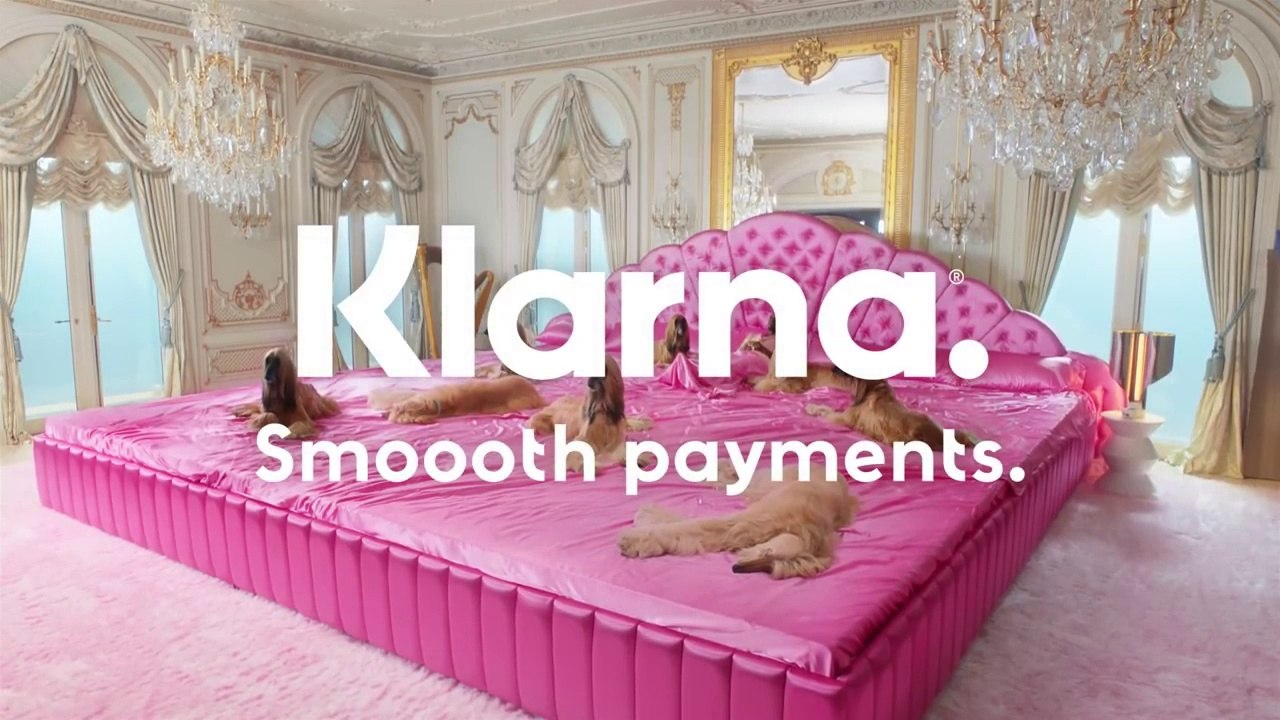
What gave us the courage to move ahead was the realisation that we needed to follow a different recipe than all our competitors in order to stand out. We wanted to show that payments don’t have to be boring and that pink actually signals accessibility and relevance rather than a lack of seriousness. It was also a way to reach a younger audience that doesn’t necessarily recognise itself in the traditional tone of voice used by banks.
What role has out-of-home played in establishing Klarna as a bold and distinctive brand?
Out-of-home is a fantastic channel for creating impact and making an impression in people’s everyday lives. You can’t just scroll past an OOH ad the way you can with digital advertising, and with our colourful brand palette it’s been genuinely fun to show up out there and capture people’s attention. In addition, out-of-home is a powerful way to claim physical space, which gives extra weight to both our campaigns and our brand.
Is there a specific campaign that stands out in your journey – and why?
My personal favourite, and a campaign we still talk about internally, is “Smoooth”. It’s iconic, and I think that’s precisely because we did everything the industry didn’t expect. “Smoooth Dogg”, fronted by Snoop Dogg, really showed our bold side. I remember from one of my first meetings with our CMO David that if anyone said, “No, we can’t do that, we’re a bank”, it only made him more determined to go through with the idea – because then it was unexpected and would make an impact. I actually believe most Swedes remember that campaign.
Kick-start autumn with us!
On Thursday, 27 August, we’re hosting the first “Creative Breakfast” of the autumn together with Brand Marketing Sweden. Among the speakers, Moa Frisk, Marketing Director at Triumf Glass, will share their brand journey from a local brand to national reach. Sign up here!
We wish you all a fantastic summer and round off this edition of “Utblick” with creative inspiration. See you in August ☀️🏖️😎🌻